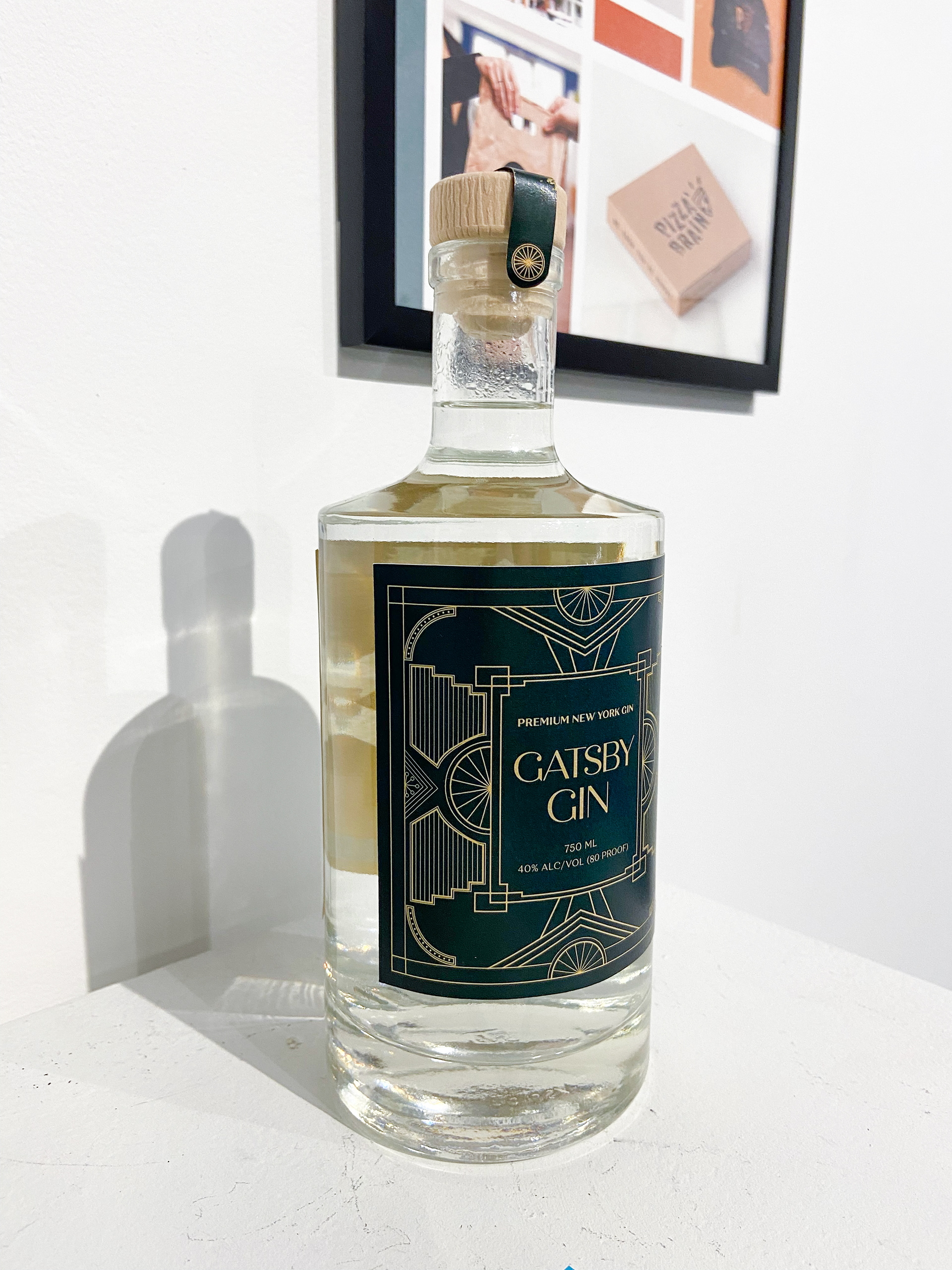
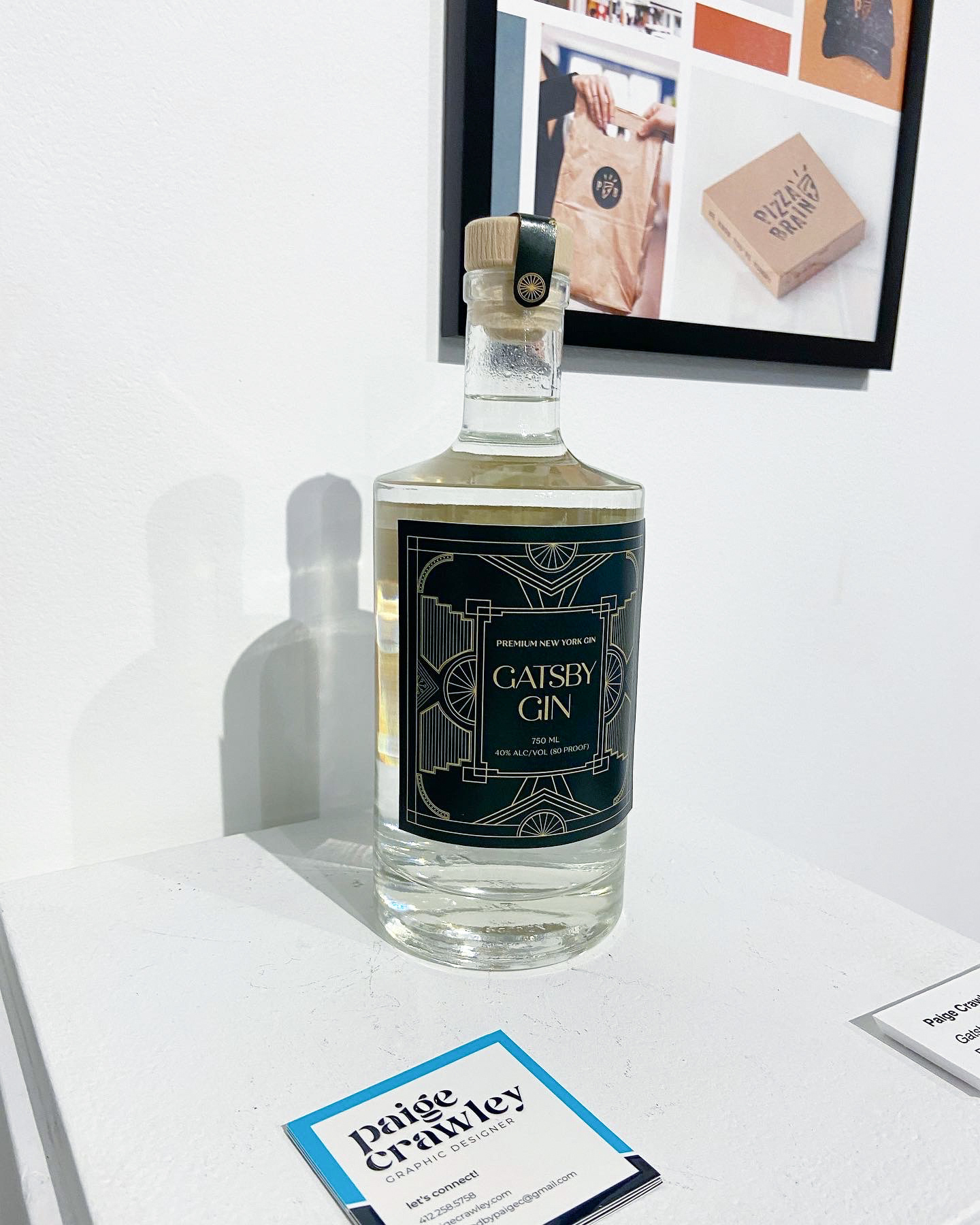
This project connects to my Art Deco: A Brief History publication. I chose to brand a gin bottle because it was a popular liquor during the 1920s, something that could often be found in underground speakeasies at the time of the Prohibition.
I wanted to bring in Art Deco elements and motifs, such as sunbursts, symmetry, and geometric forms which would relate to the overall aesthetic of the movement. To create a sense of luxury, I chose to print the label on metallic gold paper and used a deep green (almost black) color to add in the feeling of money.
View my process work here.
This project was featured in my show for the 15th Annual Michael V. Gmitter Celebrate the Artist scholarship and exhibition competition, in which I won 2nd place.
I created a logo using two G’s from the font Bifur, which was created by A.M. Cassandre during the Art Deco period, and it is featured on the top and bottom of the bottle. There is a sticker to show that the bottle has been safely sealed and steps up the product from something cheaper to something with a bit more value. I used Quiche Display and Quiche Text for my fonts, which have characteristics of the Art Deco period.
Completed: 2022
University: Pennsylvania Western University
Class: Movements
Art Director: Cassandra Reese