Read my thesis paper, "No Brand, No Bite: Impact of Brand Identity on the Food and Beverage Industry," here.
For this project, I wanted to rebrand McDonald's to be the complete opposite of what it is to show the impact branding has on your perception of a restaurant. Instead of a huge, commercial chain known for being the epitome of quantity over quality, I wanted to rebrand McDonald's to be all about farmers, quality, locally sourced ingredients, and real food.
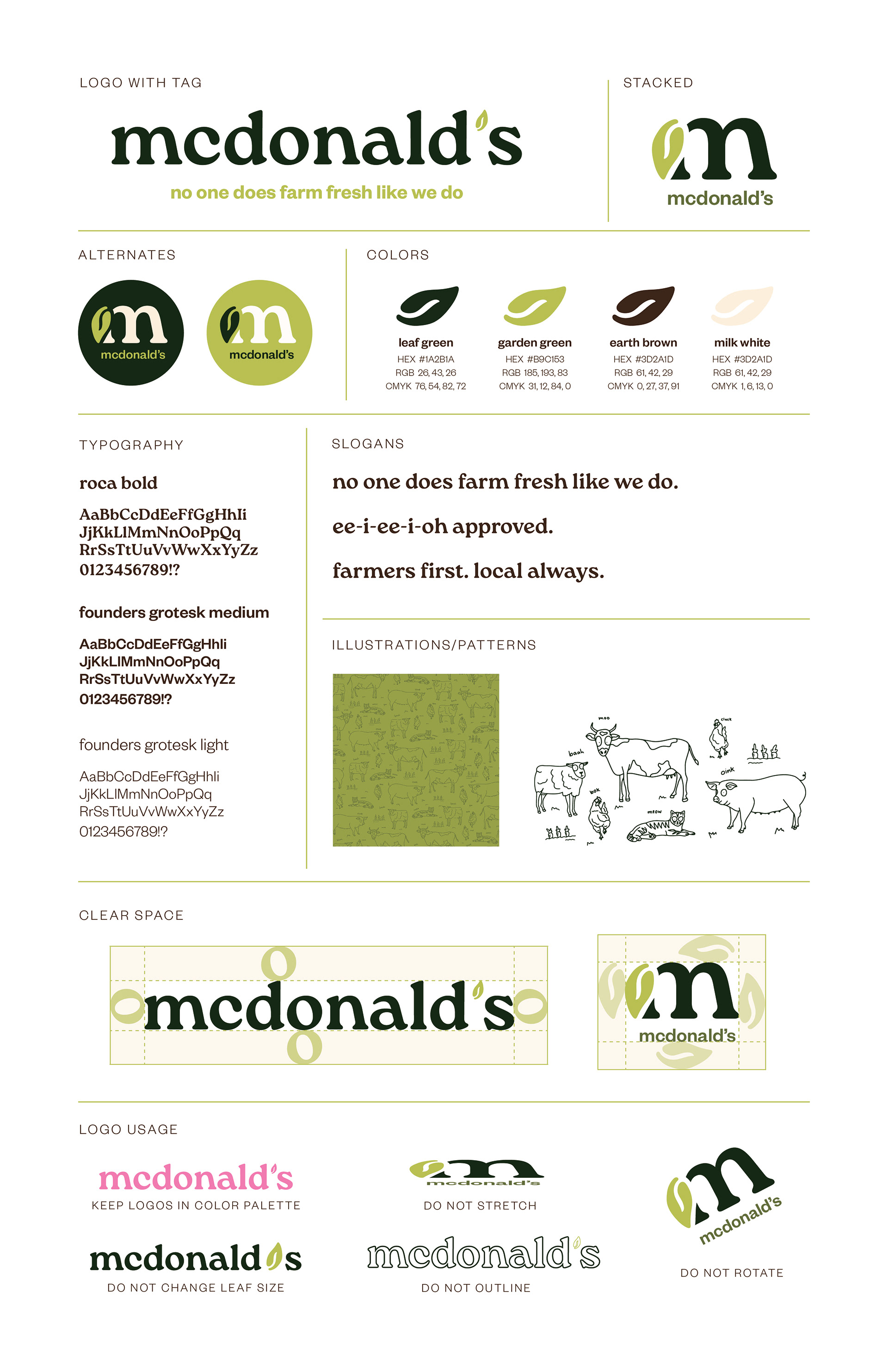
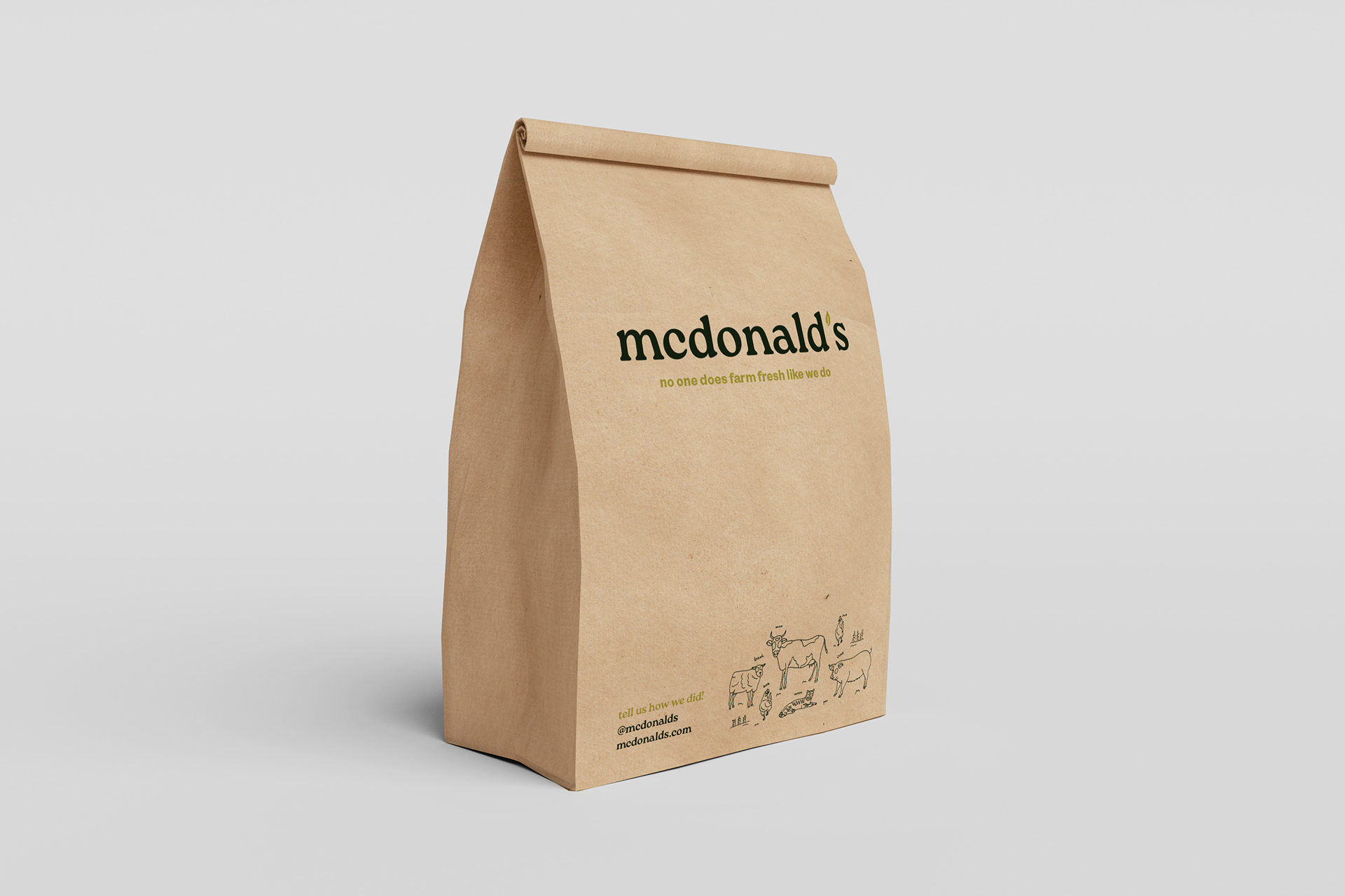
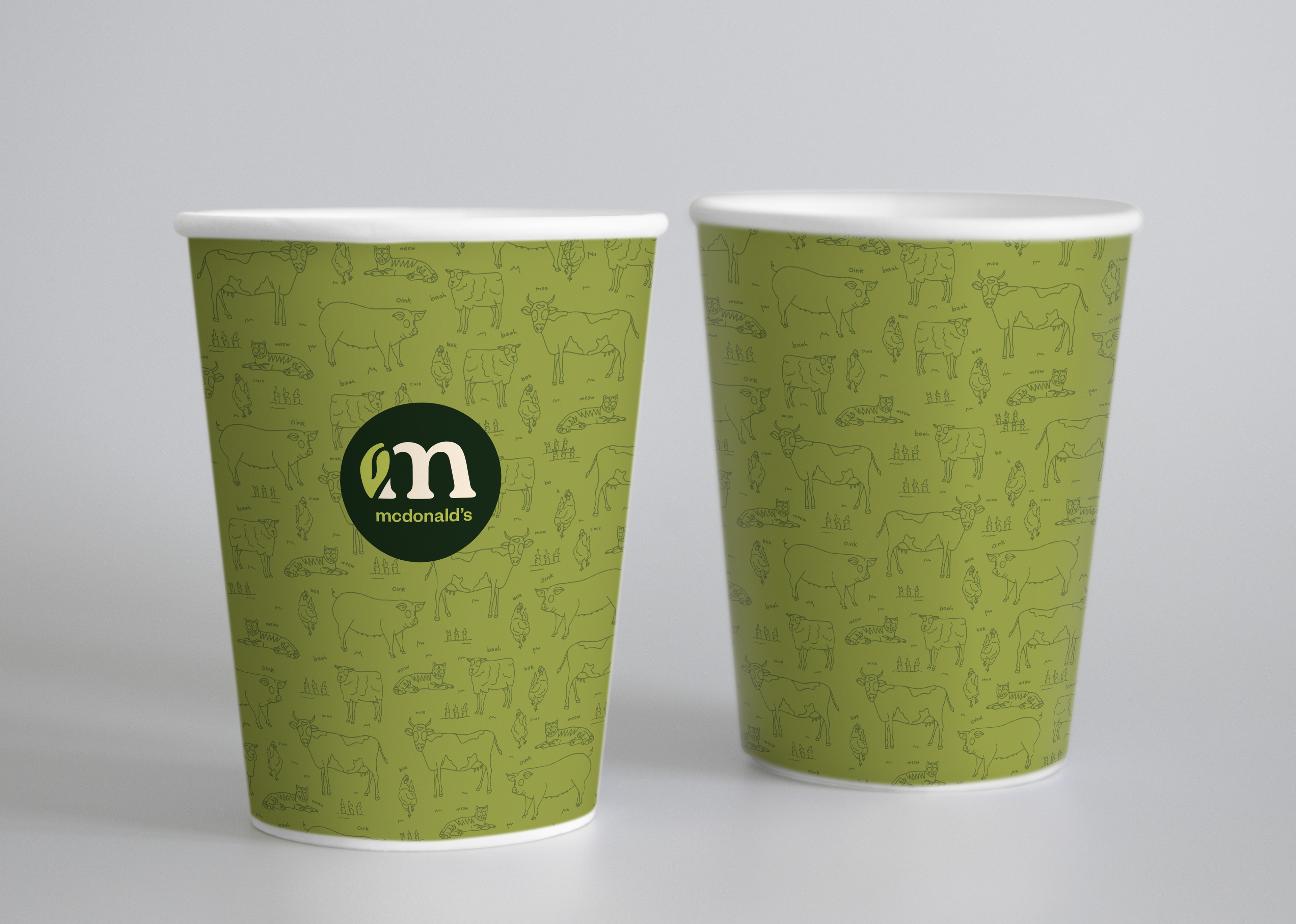
The logo is based on the typeface Roca bold, which is used throughout the rest of the brand. I customized the apostrophe to be a leaf, which is used in the alternate mark. I ditched the classic golden arches and created a brand that feels authentic, friendly, and healthy.
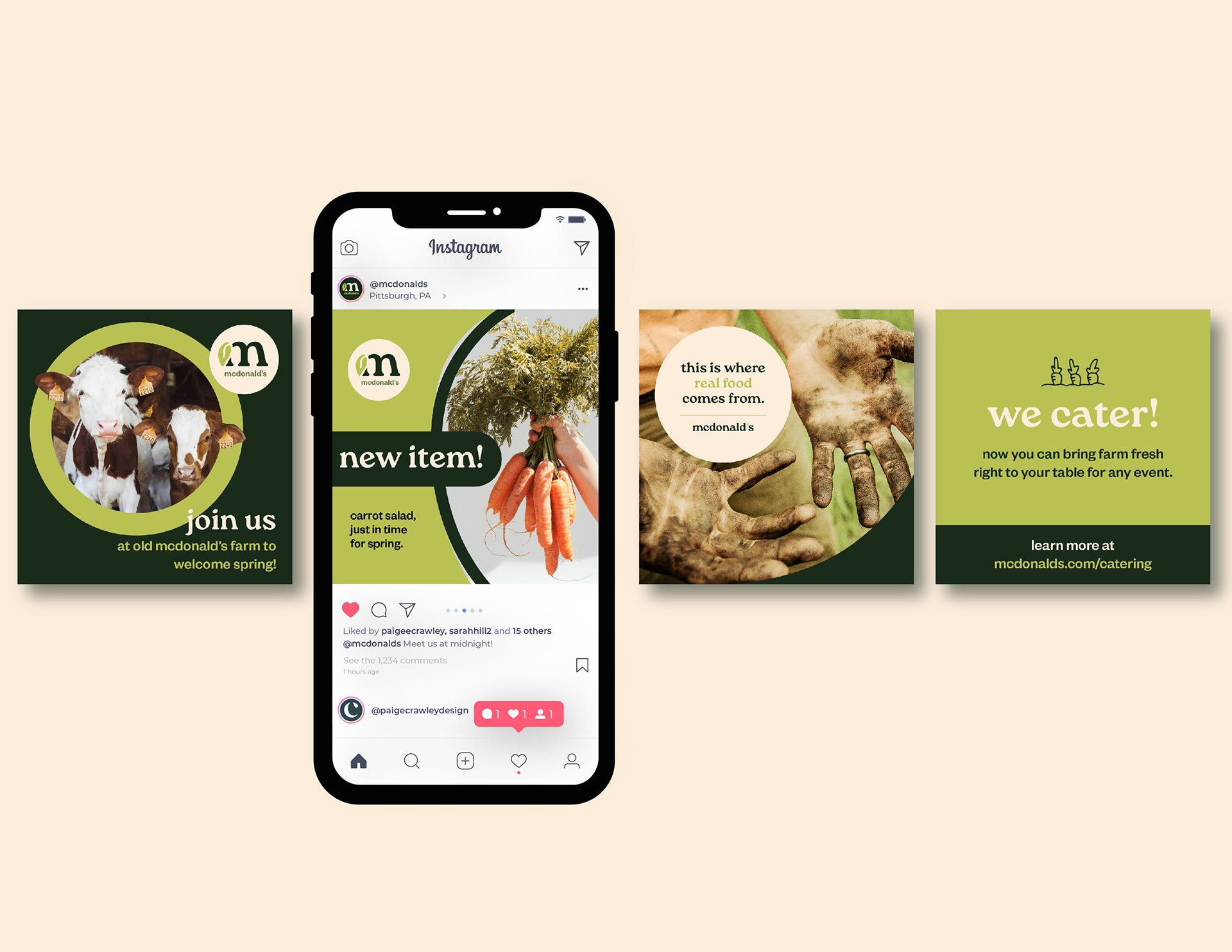
Hand drawn elements and organic shapes help call back to a a feeling of authenticity and things in nature. Images of farm fresh produce, animals, and dirty hands show where McDonald's food comes from -- from real farms and people who care.
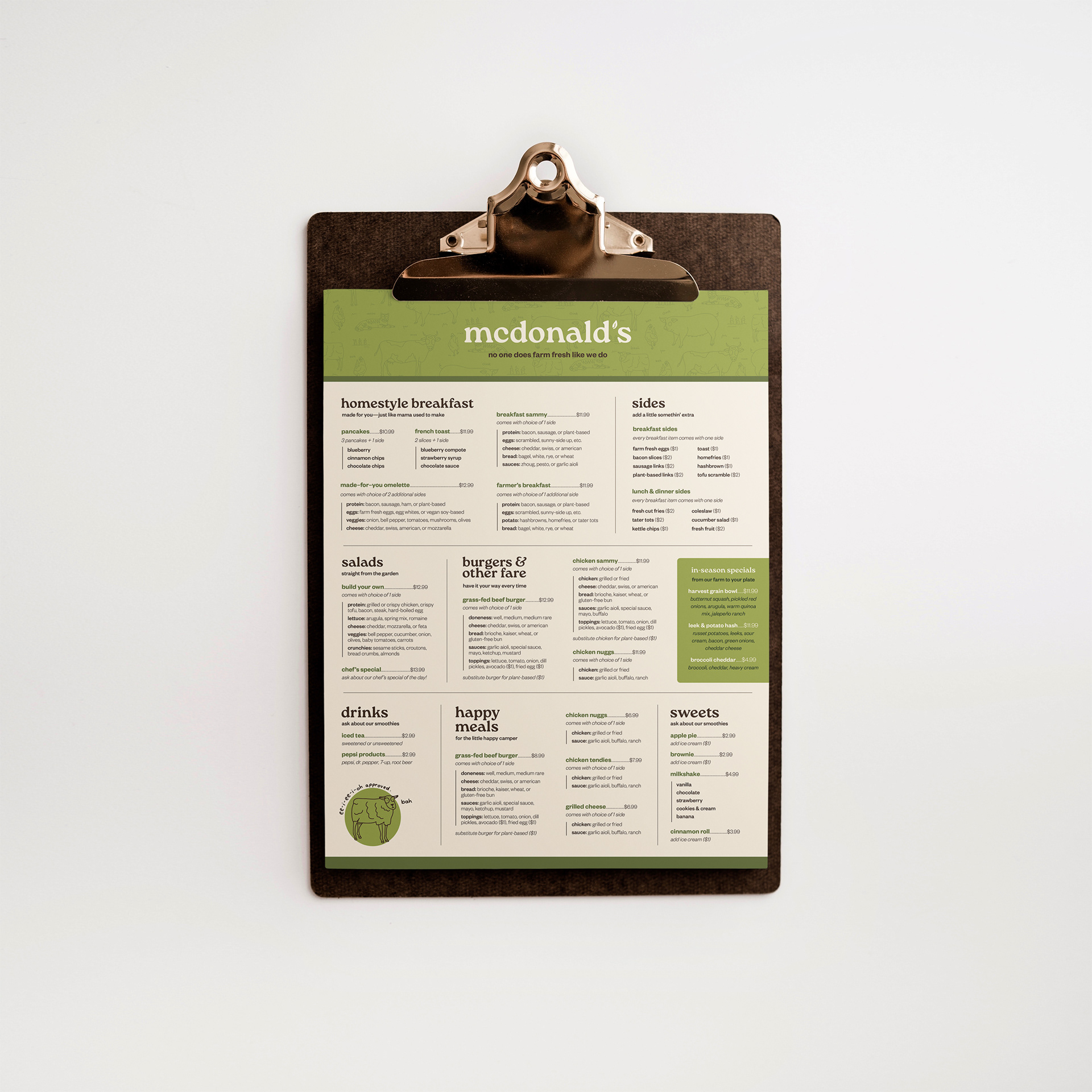
I updated the wording and menu items from the original McDonald's offerings, since language makes a big difference when people are perceiving a brand. With words like "homestyle" and "grass-fed beef," the customer will immediately perceive quality.
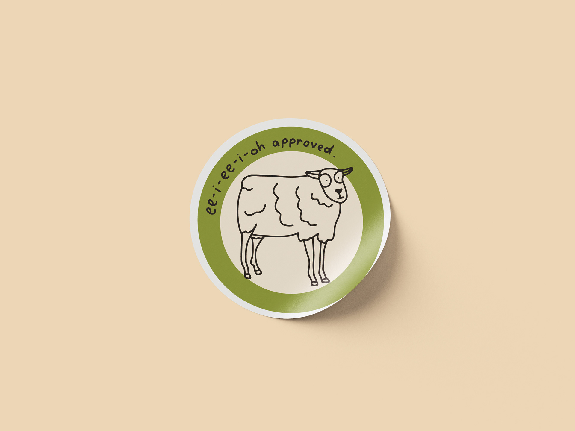
I created these goofy little animal illustrations with big eyes which is also used as a pattern. The hand-drawn quality adds a sense of authenticity and a humanistic feel. This style also matches the brand voice, which is informal and friendly. "Ee-i-ee-i-oh approved" is a riff on the classic nursery rhyme "Old McDonald had a farm," signifying that this is Old McDonald approved. And if it's good enough for Old McDonald, it must be good enough for you.
Completed: April 2024
Institution: Pennsylvania Western University
Art director: Scott Gladd
Course: Senior Projects